Responsive Web Design: What It Is and Why Your Website Success Depends on It

In today’s dynamic digital landscape, responsive web design has emerged as an essential pillar of successful online presence. It ensures a harmonious user experience across a multitude of devices and screen sizes. With strategic planning, flexible design and consistent testing, web developers can create an environment where positive user experience, website functionality and aesthetic appeal converge. Read on to learn how and why to implement responsive web design on all your domains.
What Is Responsive Web Design?
Responsive web design (RWD) is an essential tool for any modern business and has become increasingly important as more people are viewing websites from mobile devices than ever before. In essence, RWD is a solution that allows a single website to adapt and respond to the user’s device, regardless of whether they are using a desktop computer, laptop, tablet or smartphone. The goal is to provide a consistent and user-friendly experience, regardless of the device’s screen dimensions or resolution.
Why Is Responsive Web Design Important?
For most consumers, RWD is a mandatory aspect of user experience. Seamlessly adapting website layouts across devices results in longer visits and drives key actions, such as purchases. “The importance of responsive design in today’s market cannot be overstated. It’s an expectation,” says GLC VP of Digital Strategy Jason Grey.
Makes Your Site Mobile-Friendly
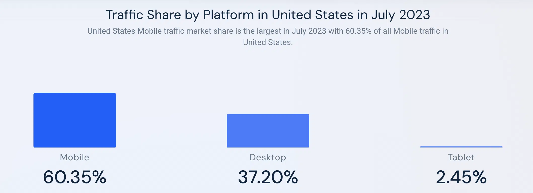
Web analytics company Similarweb reports that the majority of web traffic in the United States (more than 60%) is generated by mobile devices. This means that six out of every 10 web site visitors requires a website design that caters to screen size that is significantly smaller than the traditional desktop or laptop. Responsive web design is crucial to deliver a consistent user experience to most users.
Improves the User Experience of Your Website
With decreasing digital attention spans, a responsive user design is paramount to ensuring that your audience visits and interacts with your website. RWD allows for a consistent experience across devices, which leads to extended engagement. Better engagement yields improved search rankings, amplifying online visibility. Because top-notch UX is so common, embracing responsive web design is imperative for achieving business success and prominence in the competitive online arena.
Makes Your Website More Accessible
In addition to legacy accessibility systems and features, like screen readers, you can increase the accessibility of your website for vision- and hearing-impaired visitors with RWD. Alt text, sufficient color contrast and altered keyboard settings are all examples of inclusive design. By designing your website with these features in mind, you can create a user experience that is seamless and accessible. “The information is a resource. You need to make it easier for visitors to navigate,” Grey emphasizes.
Using inclusive language and listening to your audience are other ways to increase the accessibility of your website for all users. This forward approach ensures your site remains inclusive as technology evolves, setting a standard for equitable digital engagement.
Improves Site Speed and Performance
Testing to make sure your site has similar load times across devices is another way to ensure consistency across devices. Swift loading times enhance user engagement, reduce bounce rates and improve search engine rankings. If you’re experiencing long or vastly different loading times between devices, it could be due to a variety of factors including server load or content and image size. In this case, your website could benefit from a redesign.
3 Steps to Make Your Website Responsive
As responsive web design becomes the default, how can you adapt? Here are three best practices when implementing responsive design.
- Planning: Define your target audience and prioritize content for the different devices they use. You can review your website’s analytics to determine which devices your visitors are using when they arrive on your site.
- Media Queries: Utilize media queries to develop a liquid design that can be easily adapted to any device and screen size including older and foreign mobile devices.
- Testing and Maintenance: Test on various devices, debug and continuously improve for optimal performance and user experience.
Want More Insights Directly in Your Inbox?
Subscribe to the Content Studio newsletter for a monthly dose of content marketing articles, resources, templates and tools. Fill out the form below to join the list!


